Nowadays, grid is the foundation of almost all web design. These invisible lines create a sense of spatial rhythm and visual fluency, which are the basis for making web pages more harmonious. However, the purpose of grid existence is to help you create a good design, when you begin to adapt to the existence of grid, do not be bound by it. Occasionally breaking the grid may make your design more eye-catching. However, it is skillful to break the grid and maintain the harmony of web pages. Not all designs are good and sometimes catch the design trend is also a simple way to be good. Today, let’s talk about this.
Creative Web Design Without Grid Layouts
1. To Understand Grid Systems
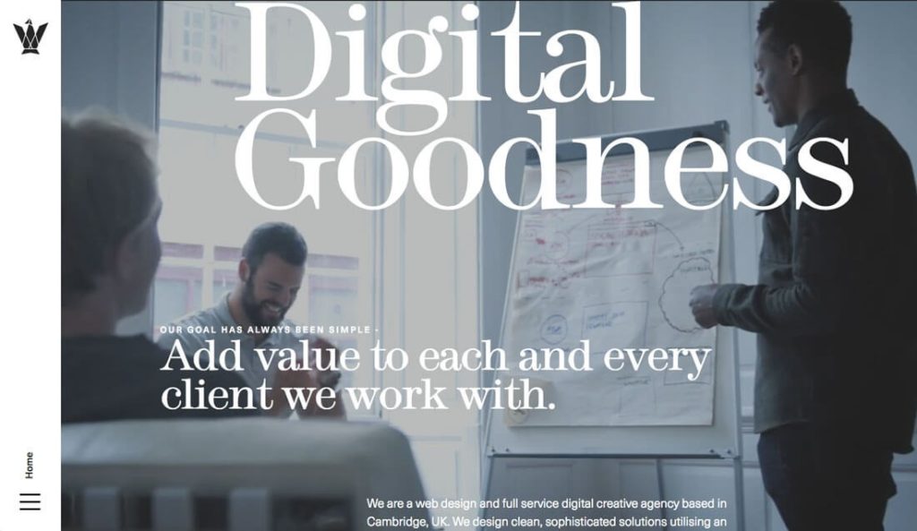
Imagesource: windowwonderland.withgoogle.com
To break the grid, you first need to understand the grid system in depth. Whatever style of grid you use, it’s the “infrastructure” of your web design process. It helps you determine how elements are to be placed, and it also helps you ensure that different controls are stacked on the page without being abruptly incongruous, so all of these keep the page organized.
In fact, designers in different fields have been using grids all the time. Look at newspapers and books. Before web designers started using grids, they had made the system work perfectly well.
There are many things a grid system can do:
- Keep content organized. In the grid system, elements are clearly arranged from left to right, from top to bottom, so that the layout remains consistent.
- ·Since regular grids regularize the layout of various UI elements. This makes design more efficient.
- Keep the spacing between elements the same, and keep the whole design neat.
Since the grid system has so many advantages, why we break the grid? It is not difficult to understand that grids create a sense of consistency and harmony, and the elements we create to break grids naturally become more “unique and eye-catching”.
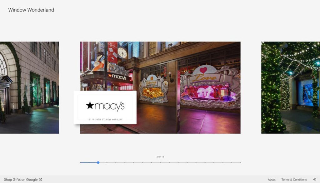
2. To distinguish layers
Imagesource: cmmnty.co
Placing different elements on different layers ensures that some elements are beyond the grid while others are consistent. Due to the popularity of Material Design, many web pages have begun to use layers to manage different elements in the web pages.
Different elements move in different layers with different rules, overlap and differentiate each other, and operate more efficiently.
Cmmnty is a web page that overlaps lines and texts with pictures and creates an unbalanced effect with the help of misplaced typesetting.
You will see the traces of the grids throughout the design, and the visual imbalance at this time is quite conspicuous.
3. To Use White Space Purposefully

Imagesource: www.sas.org.uk
To emphasize an element, leaving blanks is always the most useful means. Only by creating blanks in the right place can elements surrounded by blanks stand out.
We often think that in mobile layout, single-column or single-row layout is more reasonable. But multi-row layout is also feasible. It is important to create a more holistic visual design.
SAS, for example, is a website where designers use white space to break down traditional layout, leaving text left aligned across different blocks, with icons in the middle. This design makes these elements breaking the grid more eye-catching and attracts users ‘attention. The use of blanks creates opportunities for these elements to be noticed.
4. Place Elements Inside a Container
Imagesource: byassociationonly.com
When elements are included in some form, even if the grid system is destroyed, it often gives a sense of wholeness. This can include using color backgrounds, placing elements in boxes, or layering text onto photos or videos, as shown in the example above.
5. Try Specific Elements
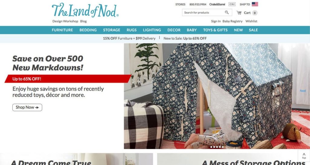
Imagesource: www.crateandbarrel.com
The best way to break the grid is to do it in detail. But this does not mean that details should be added everywhere, just like the principle of white space, if the site is full of details that break through the grid, then the site will be completely chaotic. Therefore, it is more effective to select specific elements for adjustment.
Start with an accent element to draw attention, and consider creating some unique design stuff by image editor to highlight elements.
The Land of Nod uses a longer parallelogram to “break the grid”. First of all, this shape is not common in website design. The striking red color and its semi-superimposed position make it stand out from the whole design.
6. Move It Around
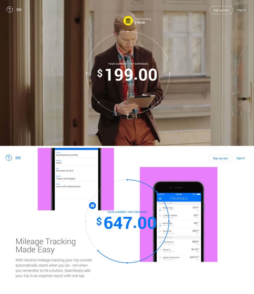
Imagesource: v1.trippeo.com
It is also a good way to get elements out of the grid system by means of dynamic effects. As with the previous one, when a single element moves, the effect will be very obvious, so that the overall grid system is not so obvious.
Of course, Trippeo takes a more radical approach: it keeps the graphical location of the intermediate billing unchanged, and all elements of the background move with it. The whole web page incorporates many technologies such as video background, raster system and parallax scrolling. It is absolutely a high integration of fantastic ideas and technologies.
7. To Create the Illusion
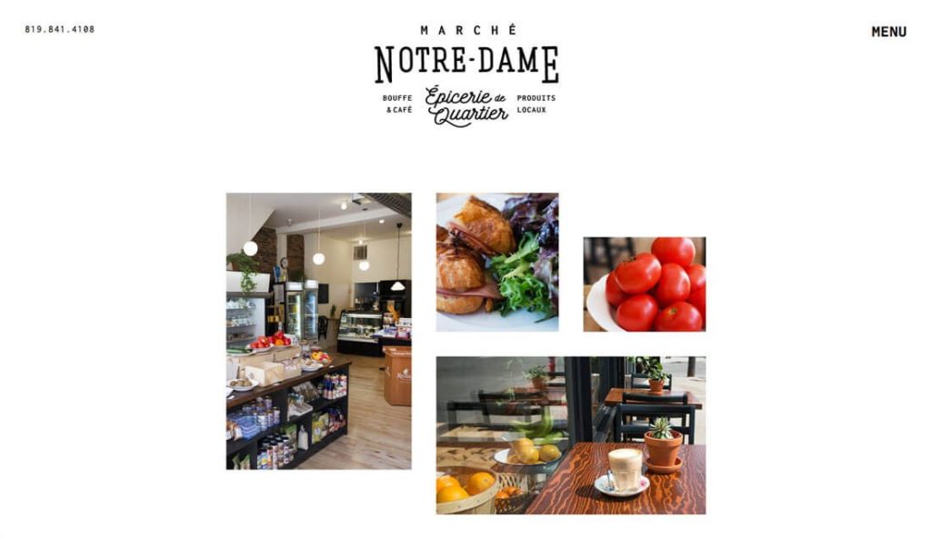
Image-source: marchenotredame.com
Sometimes, you can use interesting shapes and asymmetrical Collocations to create a “broken” effect in the grid system. You can still make full use of the advantages of the grid system and do something different at the same time. The best way is to design with odd rows and columns, with incomplete or inadequate element filling in.
Web Ninja Studio is a web design company and digital agency based in Chan Sow Lin, KL Malaysia. Also, specialize in web design, web development, eCommerce website design, organic SEO, branding and digital marketing services.
Conclusion
It’s not always easy to break grids. Sometimes it becomes a mess. How can we add fantastic ideas without destroying the whole project? It’s always right to practice more.


Leave a Comment
You must be logged in to post a comment.