We have come a long way from Da Vinci’s and Picasso’s time. Today, art is commercialised. Images, gifs, videos, memes and banners are all measured by how much likes, engagement and conversions it can generate for your business.
Graphic designers therefore have got a lot to think about. From working out great concepts for the marketing campaign to deciding on the graphic style, color strategy, layout, positioning, and hierarchy, there are several factors that will influence your composition.
While it’s not easy to judge one’s own design, an understanding of the key design principles can help you develop that critical eye to optimise and assess where your designs fall on a scale of 1 to 10. That is, from okay-looking designs to ones that could unleash a flood of engagement for your business.
With that in mind, let’s get started with the design thinking principles you can use to create graphics that look great while being in line with your business goals.
1. The Human Rule
Graphic design is ultimately about communication. Every piece of design- whether an image, banner, meme, infographic, gif or video- are all created for the purpose of communicating an idea to a specific target audience with the goal to trigger a specific action.
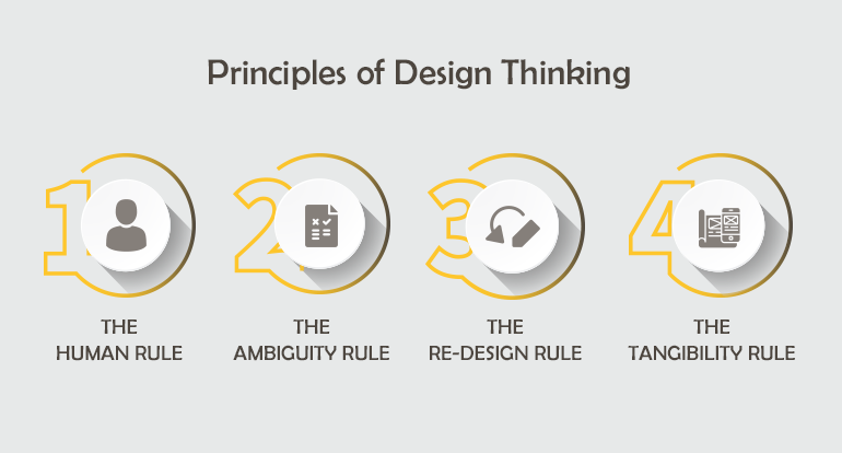
So, when you sit down to design something, look at it from a human-centric point of view; think what kind of design will help grab your audience’s attention?
To help you come up with effective design concepts, here’s a simple design strategy. Before you start thinking about “how” to create a design, have answers to these questions first:
- What is the message that you are looking to communicate?
- Who is your target audience?
- Where will this design go? Will it be posted on social media (which one- Facebook, Twitter, Instagram, Pinterest or LinkedIn) or on the website? Note that the marketing platform will decide the layout and format of your design.
- Why are you making this? Your CTA?
- Which emotion are you looking to trigger in the viewers? Which emotion will get your audience to react to your call to action- anxiety, fear, excitement, hope, happiness? Take one of these emotions and start designing.
Also, practice co-design. That is, get the creative brief and feedback from the stakeholders associated with the product or service before and during the design process. Timely feedback helps you build graphic that meets your client’s vision and goals.
Design is a medium to market ideas. By understanding who you are making the design for and why you are making it, you would be able to craft graphics that the audience can relate to and engage with.
2. The Art of Visual Balance
Visual balance is like a frame that holds the different visual components in one place. It makes the graphic appealing to the eye, while also helping put the limelight on the important bits.
To create a visually balanced graphic, consider these factors:
- Hierarchy- This is about directing your viewer’s eye. Which element should they first see? Which element should they see last? To create a hierarchy in the various elements of your graphic, try scaling the object’s size or tweak the color weight accordingly.
- Grid- This is for the purpose of alignment. By arranging the different elements of your graphic in a specified width, you can create symmetry.
However, symmetry is not the only key to visual balance. Balance can either be symmetric or asymmetric. So don’t always stick to rules though; experiment with Randomness.
3. The Appeal of Ambiguity
“There are three responses to a piece of design – yes, no, and WOW! Wow is the one to aim for.” That’s Milton Glaser, one of the century’s top graphic designers.
So how do you make people say wow to your design? Here, ambiguity often plays a key role. Ambiguity is all about adding different layers and details in your work, such that it is open to more than one interpretation.
In short, it’s about letting your viewers “see things differently”.
Ambiguity is important, because our brain remembers things that stand out from the norm.
In one study, researchers discovered that “the higher the subjectively perceived degree of ambiguity within an artwork, the more participants liked it, and the more interesting and affecting it was for them.” Mona Lisa is not famous for nothing. Some people say she is smiling while others fail to see the smile. What do you see?
4. The Color Wheel
Color is the backbone of design. The color transitions have to be very smooth in order to avoid what you would call “color awkwardness”.
To help you create a good color strategy, it is best to pick colors that lie close to each other on the color wheel. Or, for contrast, you can pick color that lies directly opposite it.
5. The Consistency/Repetition Rule
Repetition in graphic design is used to create the brand identity. Things become more ingrained in our minds when they are repeated. This is true for text as well as for images. By using the same style of text and color theme in your graphic, you can create individual graphics that become a part of your brand.
This allows viewers to instantly recall your brand because they relate you to these elements. So, when you are creating a graphic design for a brand, be consistent with the color, fonts and other design elements.
6. The Power of Whitespace
Visual clutter creates graphic noise. You can use whitespace to let your graphics breathe or less congested.
Note that there are two types of whitespace- active white space, which you add purposefully in your graphic to separate elements and passive white space which is the default space you left around at the borders or in between the content to balance the layout and improve readability.
There’s also the concept of “negative space”, which refers to the section on your graphic with “nothing”, just blank space. But in graphic design, nothing is same as “something”. Negative space therefore create a sense of ambiguity, helping you craft clever, witty designs.
7. The Contrast Advantage
Contrast in design can help create a visual hierarchy by helping some elements stand out from the rest. This is ideal to create emphasis, or put the focus on certain parts of your graphic.
However, note that contrast is not just black and white. Contrast can be created by both colors and font. In flat design, contrast also helps create a sense of layers.
Conclusion
Great concepts don’t always lead to great designs. The difference between the good and the great design comes down to its execution. By using these design principles, you can create clever, witty graphics that deliver your business’s marketing message to the said audience.
What kind of design strategy do you follow? Let us know in the comments below.


Leave a Comment
You must be logged in to post a comment.