When it comes to your businesses website, it’s vital your website is up to date and utilizes new web technology. Websites have come a long way since the early 2000’s and are continuing to evolve every year.
With the introduction of new programming languages such as HTML5 and new web standards, websites are no longer just a page with text on them. New programming languages allow websites to do a lot more complicated things that were basically impossible a few years ago.
Why Responsive Web Design Is Crucial for Every Business
One of those features is responsive web design. If you don’t know what that means then you should. Not having responsive web design on your website could cost you lots of customers and hundreds of potential sales.
So just what is responsive web design and why should you care?
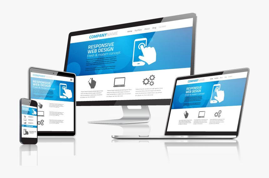
What Is Responsive Web Design?
If you’ve never heard of responsive web design before, then it might sound very confusing. Responsive to what? You may be asking. Why does it matter? Why is it so important?
Well to put it simply, responsive web design is a type of website that is viewable on any web device. This means no matter if you’re using a phone, tablet, computer, wi-fi fridge or toaster, your website will look perfect.
Check out this web design agency for creating stunning websites with exceptional UI/UX and brilliant SEO, PPC and Inbound Marketing strategies focused on the B2B industry.
It might not sound like a big deal, but it is.
By having a responsive website, it allows your visitors to easily use your website without any problems. More specifically it allows mobile users to explore your site without any problems. It’s no secret that most websites are viewed on desktop PC’s and therefore are optimised to look the best on them. Since they are optimised for desktop PC’s this often means they lack usability on other devices such as tablets and mobiles.
A responsive website fixes this issues by allowing the website to “respond” to the device it is being viewed on. This means to matter how big or small your screen is, your website will look perfect on any device.
Why Does it Matter?
Having a responsive website is pretty much essential for businesses nowadays.
In the early 2000’s almost no one was viewing websites on their mobile. The big change came in 2007 when the first iPhone was released. Since then there have been numerous iPhones and other smartphones that have become available on the market.
This surge in mobile users means that more people than ever are now using their phone to view websites.
If your website isn’t responsive, then there’s a good chance it won’t work as intended on mobile. This means things such as users not being able to click certain buttons, view pictures or even read the text on the website.
If users can’t use your website on mobile as intended, then they are very likely to leave. Obviously, as a business, you want as many people as possible to stay on your website in order to generate sales and leads. If every mobile visitor you get is leaving, then that’s a significant percentage of your traffic gone.
Making sure your website is responsive is the number priority nowadays for many businesses. A lot of businesses still have old and “out of date” websites that haven’t been updated for years. Not only does this give their business a bad image, but it also means a lot of mobile users will struggle to view their website.
Responsive Web Design Examples
Since we’ve talked so much about responsive web design, it would be useful to give you some examples of responsive websites.
AHM Installations
This small business proves that you don’t need to be a huge multinational company spending millions on web design to have a responsive website. Specialising in walk in showers and wet rooms, AHM have plenty of information about their services available on their website. As the main sales page and information for their customers, It’s a good job their website is responsive!
As you can see on the website, once you first land on it, everything is in the right place. There’s a menu at the top, a sliding gallery and plenty of content down the page. For desktop users, the website works perfectly, which is no surprise.
But what about when viewed on a smaller mobile device?
To try it for yourself adjust the size of your web browser and see how the site changes.
The first thing you’ll notice is how the main menu in the middle disappears and is replaced by a smaller side menu on the right. The menu and functionality are still there; it’s just smaller and more compact.
If you scroll down and start reading the content, you’ll notice it’s still there just a lot more squished up. The pictures also automatically resize themselves to fit into the available space, which is an excellent example of how responsive websites work.
Natalia Barbour
Natalia Barbour is a high-end interior fashion designer that specialises in making award winning interior spaces for international clients. Her website plays a vital part in showcasing her past work and portfolio to potential customers.
In addition to the portfolio, the site also includes an online e-commerce store where customers can browse and buy a whole range of products. Since the website is a vital part of her business, it’s crucial that it can be viewed on any device.
When you first visit the homepage on a desktop PC, the menu is located at the top, and you’ll be greeted with an autoplay video. Since the homepage doesn’t contain much content, it’s vital the menu is visible so that users can explore the site.
If you resize the browser and make it slightly smaller, you’ll notice how suddenly everything becomes responsive. The logo at the top goes from being centred to left aligned, as the menu becomes a compact side menu on the right-hand side.
The autoplay video in the centre is also resized and fits perfectly on the page no matter how small it is. By adapting the website to the visitor’s device, it gives users a much better experience rather than awkwardly trying to scroll and click microscopic buttons.


Leave a Comment
You must be logged in to post a comment.