When it comes to colour, pattern and texture many homeowners are afraid to go bold in fear of the outcome. Whilst a neutral interior is nice (and safe) it can lack character and not be a true reflection of the person that you are. Pushing your own boundaries and opening up to the idea of introducing more colourful and daring interior elements definitely pays off if you do it right.
Colour, Pattern and Texture
Why does a home need a colour pattern and texture?
At present we are spending more time in the home than we imagined possible. As such, our interiors shouldn’t feel too boring and serious. Now more than ever, it’s important for our homes to feel a little bit playful and even evoke a sense of whimsy to help create an escape from the grim.
Colour uplifts and energizes. Soft textures can be therapeutic and patterns create an inspirational and striking focal point. When combined, they can breathe life into an interior and give it a soul.
How to introduce colour, pattern and texture to the home?
Home renovation is quite tricky and challenging at the same time. Usually, a homeowner gets someone to do the drafting first and work with the renovation later if everything looks good within the proposed design. The great thing about incorporating colour, pattern and texture within a space is that you can choose to go as minimalist or as maximalist as you wish. However, generally somewhere in between creates a nice balance. Creating ‘balance’ is the key objective to combining these elements successfully.
This article will guide you through how to do exactly that in 5 easy steps so you can create a home to be proud of when it’s time to invite guests over again.
Step 1: Decide on your colour palette
You don’t need to say goodbye to white, in fact breathing space is a good thing and is important for an interior to have somewhere for the eye to rest. There are varying degrees of white and even paler colours that can be introduced if bolder, strong colours aren’t quite your cup to tea.
The best way to decide on what colour palette to choose is to find inspiration first. There is no shortage of inspirational imagery in design magazines and the internet. If in doubt, speak to an expert.
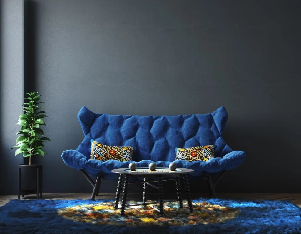
Step 2: Follow the 60:30:10 rule
Creating a cohesive colour palette doesn’t come about through just intuition; many interior designers follow the 60:30:10 rule. This is a tried and tested formula that can be used to build confidence when selecting colour.
60:
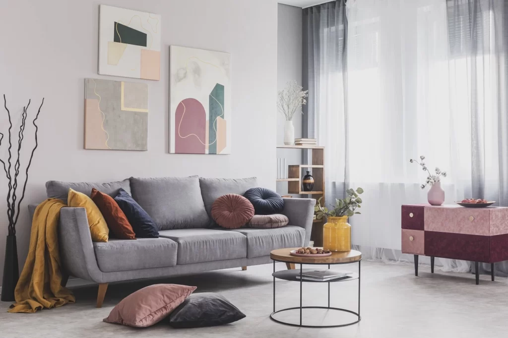
This will be your most dominant colour for larger areas such as walls mainly and sometimes flooring. It will make up 60 percent of the room’s colour palette.
30:
30 percent of your chosen colour palette can consist of a couple of additional colours from your chosen colour combo. Or if you would like to create a feature wall of colour or pattern, 30 percent is a good ratio.
10:
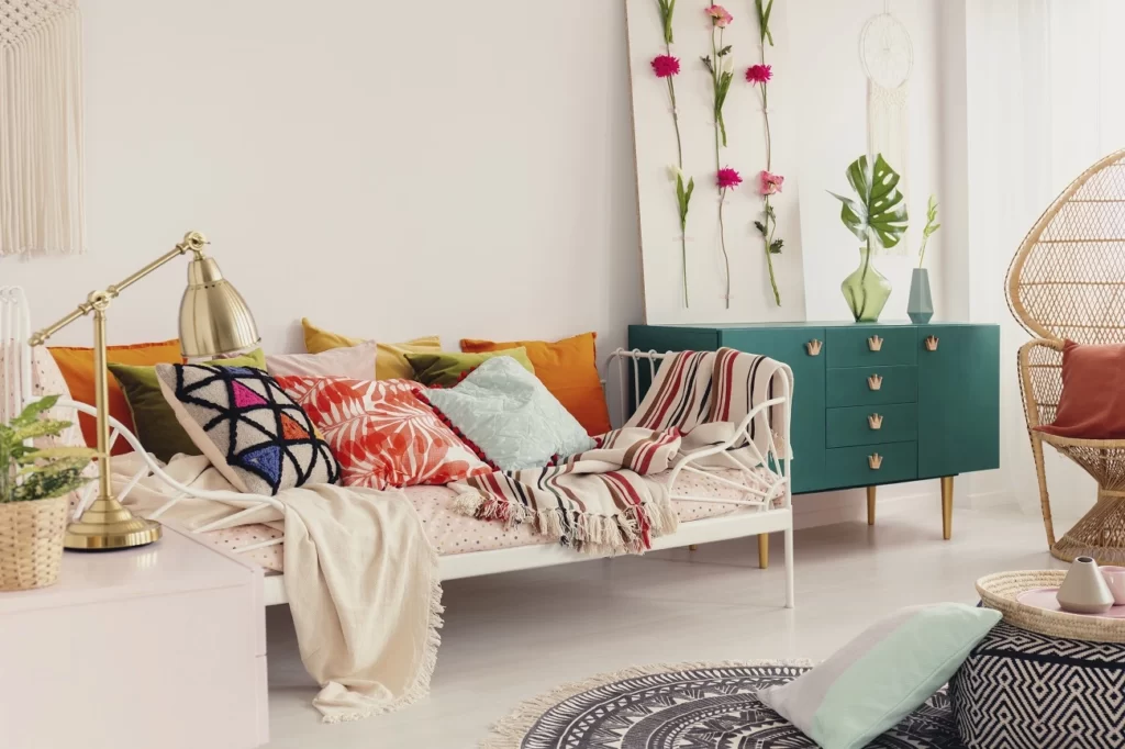
The last 10 percent is reserved for accent colours only. These are little touches of colour that may be bolder than the colours used in your 60:30 mix. Alternatively, if your 60:30 mix consists of darker, more moody hues, this 10 percent can be lighter and brighter to add some contrast. This is also where patterns can come in the form of cushions or other small accessories.
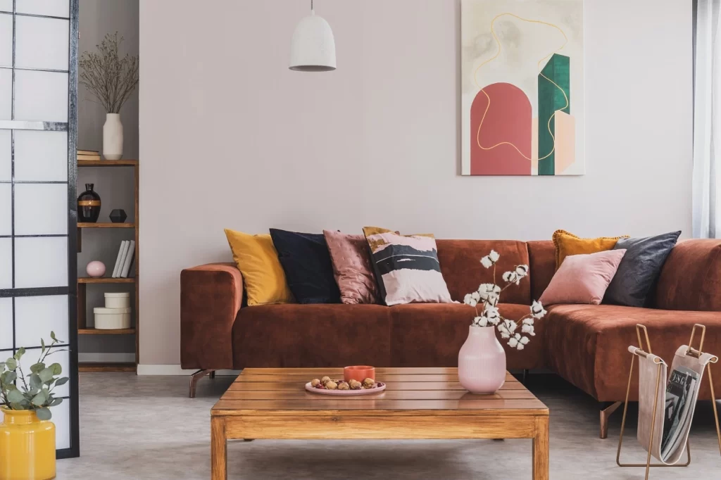
Step 3: Selecting a pattern
This is the really fun part, there are so many options when it comes to patterns. Patterns can be introduced by way of wallpaper, art, furniture, rugs or accessories. Here, it is important to be mindful and not overdo it. Patterns can clash or work together harmoniously. Not everything in the room needs to have a pattern.
Ideas for combining pattern
You may choose a striking patterned rug to act as your focal point and complement the space with patterned accessories such as cushions on a plain upholstered sofa. Or you may choose a patterned armchair upholstery and create a feature wall with a patterned wallpaper. Alternatively, a wall painted in a bold colour, offset by a gallery wall of paintings and prints with pattern is another way to introduce colour and pattern. The options are limited only by the imagination.
Things to consider when selecting a pattern.
- Colour consistency
The trick is to find a balance by selecting patterns that are consistent in their colour palette and depth of colour. For example; don’t attempt to combine pastel toned patterns with bold and vibrant colour patterns. Try to keep the number of colour variations to about 3 or 5 at the maximum. Odd numbers are best.
2. Scale and proportion
Consider the scale of the pattern. Smaller scale patterns work well with larger scale patterns. If patterns are all of the same scale there is less visual interest and patterns will compete against each other.
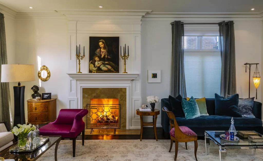
Step 4: Adding texture
Texture is the easy one to add to an interior, you can’t really overdo texture the same way you can colour and pattern. Texture can be neutral if needed but incorporating lovely layers of texture is important both from a visual and tactile stand point. Texture can be shiny and smooth, rough and raw, or soft and cuddly.
What interior elements have texture?
Texture can be introduced by way of furniture or materials and finishes. For example, an ottoman or footstool can be upholstered in a tactile fabric. Wallpaper can have a textured finish, even plants are tactile.
Anything with a natural fiber will add texture. Items such as baskets, throw blankets, wall hangings and cushions are easy wins for adding texture.
Why add texture to an interior?
Introducing these elements will add depth to the space and make your home feel more cosy and inviting.
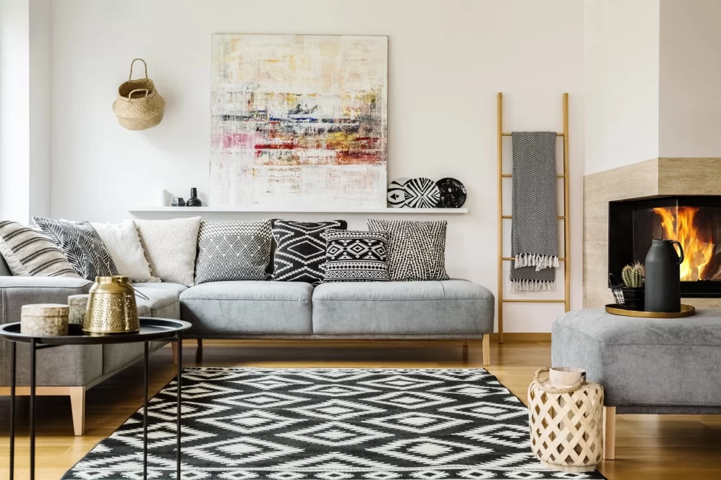
Step 5: Style your space
Once you have decided on your colour, pattern and texture combinations and made your selections, it’s time to bring all of the pieces together and style your space. This the final step in the process and the most rewarding. You can finally see your design come together and your personality shine through.
How to style a space
Styling a space isn’t always so easy. Creating a space that feels like it hasn’t been over-styled is important. When placing the items you have chosen, keep in mind that less is more. However, don’t be afraid to experiment. You will begin to see what works and what doesn’t. If you need to, take a break and go back to the room with fresh eyes. Take photos, sometimes your eye detects if something is out of place better in a photo than by looking at the space.
How to accessorise:
When placing accessories, create little vignettes of objects in groups of 3. Grouping elements that are similar in colour or texture works nicely.
Stand back and look at your space with a critical eye. Don’t be afraid to pull back and remove items if the space is beginning to feel a little cluttered or overpowered by certain elements. It’s important for the eye to find a place to rest.
Author: Sarah McCahey, Superdraft is an experienced interior designer, and works for Superdraft, a project coordination platform that helps customers plan, design and build their dream space.


Leave a Comment
You must be logged in to post a comment.